Last time
Importance of visualization to better understand data
=> e.g. Soho epidemics map
Why visualize your data?
Anscombe's quartet
| Dataset #1 | Dataset #2 | Dataset #3 | Dataset #4 | |||||
|---|---|---|---|---|---|---|---|---|
| x | y | x | y | x | y | x | y | |
| 10 | 8.04 | 10 | 9.14 | 10 | 7.46 | 8 | 6.58 | |
| 8 | 6.95 | 8 | 8.14 | 8 | 6.77 | 8 | 5.76 | |
| 13 | 7.58 | 13 | 8.74 | 13 | 12.74 | 8 | 7.71 | |
| 9 | 8.81 | 9 | 8.77 | 9 | 7.11 | 8 | 8.84 | |
| 11 | 8.33 | 11 | 9.26 | 11 | 7.81 | 8 | 8.47 | |
| 14 | 9.96 | 14 | 8.1 | 14 | 8.84 | 8 | 7.04 | |
| 6 | 7.24 | 6 | 6.13 | 6 | 6.08 | 8 | 5.25 | |
| 4 | 4.26 | 4 | 3.1 | 4 | 5.39 | 19 | 12.5 | |
| 12 | 10.84 | 12 | 9.13 | 12 | 8.15 | 8 | 5.56 | |
| 7 | 4.82 | 7 | 7.26 | 7 | 6.42 | 8 | 7.91 | |
| 5 | 5.68 | 5 | 4.74 | 5 | 5.73 | 8 | 6.89 | |
| Regression | ||||||||
| Dataset #1 | Dataset #2 | Dataset #3 | Dataset #4 | |||||
|---|---|---|---|---|---|---|---|---|
| Mean | 9 | 7.5 | 9 | 7.5 | 9 | 7.5 | 9 | 7.5 |
| Variance | 11 | 4.1 | 11 | 4.1 | 11 | 4.1 | 11 | 4.1 |
| Correlation | 0.86 | 0.86 | 0.86 | 0.86 | ||||
| Regression line |
y = 3 + 0.5x | y = 3 + 0.5x | y = 3 + 0.5x | y = 3 + 0.5x | ||||
Why visualize your data?
Describing a dataset
- What is the general shape of the data?
- Where are the data values centered?
- How do the data vary?
These are all aspects of what we call the distribution of the data.
General shape of a distribution
A symmetric distribution is one in which the left and right hand sides of the distribution are roughly equally balanced.
A skewed (non-symmetric) distribution is a distribution in which there is no such equal balance. Right-skewness refers to a longer right tail, while left-skewness correspond to a longer left tail.
A uniform distribution is a specific symmetric distribution in which all outcomes are equally likely.
Data distribution examples
Internet access in the world
Time between eruptions of the Old Faithful geyser (1978-1979)
- Yellowstone National Park -


Proportions for categorical variables
Proportions are also called relative frequencies and we can display them in a relative frequency table.
Is there one true love
for each person?
(Phone survey, 2010)
| Response | Frequency | Relative Frequency |
|---|---|---|
| Agree | 735 | 0.28 |
| Disagree | 1812 | 0.69 |
| Don't know | 78 | 0.03 |
| Total | 2625 | 1.00 |
Notation for a proportion:
The proportion for a population is denoted $\pi$
The proportion for a sample is denoted $\overset{\hat{}}{p}$ (read “p-hat”)
Distribution of proportion data
Note:
Lengths are easier to visually compare than area
Distribution of proportion data
Stacked bars (overall quantity)
Layered bars (distribution of values in the categories)
Grouped bars (comparison of categories + items)
Distribution of quantitative variables
A common way to visualize the shape of a moderately sized dataset is a dotplot.
| Species | Longevity | Species | Longevity | Species | Longevity | Species | Longevity | Species | Longevity |
|---|---|---|---|---|---|---|---|---|---|
| Baboon | 20 | Chimpanzee | 20 | Fox | 7 | Leopard | 12 | Rabbit | 5 |
| Black bear | 18 | Chipmunk | 6 | Giraffe | 10 | Lion | 15 | Rhinoceros | 15 |
| Grizzly bear | 25 | Cow | 15 | Goat | 8 | Monkey | 15 | Sea lion | 12 |
| Polar bear | 20 | Deer | 8 | Gorilla | 20 | Moose | 12 | Sheep | 12 |
| Beaver | 5 | Dog | 12 | Guinea Pig | 4 | Mouse | 3 | Squirrel | 10 |
| Buffalo | 15 | Donkey | 12 | Hippopotamus | 25 | Opossum | 1 | Tiger | 16 |
| Camel | 12 | Elephant | 40 | Horse | 20 | Pig | 10 | Wolf | 5 |
| Cat | 12 | Elk | 15 | Kangaroo | 7 | Puma | 12 | Zebra | 15 |
Note:
For this particular dataset, values are integers and can be easily stacked.
Simplifying a dotplot
A dotplot can be hard to build, and dots can overlap (visually) if the values are very similar and a lot of values are represented.
1- Define "boundaries"
2- Count the number of elements inside each zone
This is the process to make what is called a histogram.
The histogram
Dataset:
| 36 | 25 | 38 | 46 | 55 | 68 | 72 | 55 | 36 | 38 |
| 67 | 45 | 22 | 48 | 91 | 46 | 52 | 61 | 58 | 55 |
| Bin | Frequency | "Scores" included |
|---|---|---|
| 20-30 | 2 | 25, 22 |
| 30-40 | 4 | 36, 38, 36, 38 |
| 40-50 | 4 | 46, 45, 48, 46 |
| 50-60 | 5 | 55, 55, 52, 58, 55 |
| 60-70 | 3 | 68, 67, 61 |
| 70-80 | 1 | 72 |
| 80-90 | 0 | -- |
| 90-100 | 1 | 91 |


Note:
- Number of bins = $\sqrt{n}$ is a good start to explore your data.
- Usually all the bins cover the same data range (similar bin width), but uneven bins can also be constructed.
The characteristics of a histogram
The mean
A common measure of central location is the (arithmetic) mean. It is sometimes called the average.
$\bar{x}=\sum x_{i}$
$\bar{x}$ for a sample (read "x-bar")
$\mu$ for a population
Which corresponds to:
$\bar{x}=\frac{x_{1}+x_{2}+...+x_{n}}{n}$
$\bar{x}=\frac{\textrm{sum of all the observations}}{\textrm{number of observations}}$
The trimmed mean
A trimmed mean refers to the calculation of the mean after discarding given parts of a sample (or distribution) at the high and low end (typically discarding an equal amount of both).
Some people consider that the use of a trimmed mean "helps" eliminate the influence of data points on the tails that may affect the traditional mean.
| 1 | 23 | 19 | 24 | 17 | 26 | 20 | 23 | 89 | 82 |
$\bar{x}=\frac{1+23+19+24+17+26+20+23+89+82}{10}=32.4$
$\bar{x}_{trimmed}=\frac{23+19+24+17+26+20+23}{7}=21.7$
Never use it!
The median
The median of a set of ordered data values is:
- the middle entry (for an odd number of entries)
- the average of the middle 2 values (for an even number
of entries)
mean of $(\frac{n}{2})^{th}$ and $(\frac{n}{2}+1)^{th}$ observations
$(\frac{n+1}{2})^{th}$ observation
The mode
The mode is the value that occurs most often in the dataset. If no value in the dataset is repeated, then there is no mode this particular dataset.
What is the mode in the dataset below?
| 4 | 5 | 9 | 5 | 11 | 7 | 5 | 3 | 7 | 8 | 6 | 5 | 12 |
Multimodal distribution

In a bimodal distribution, the taller peak is called the major mode and the shorter one is the minor mode.
Resistance
The term resistance is related to the impact of outliers on a statistic. In general, we say that a statistic is resistant if it is relatively unaffected by extreme values.
The median and the mode are resistant, while the mean is not.
| 2.5 | 3.2 | 3.5 | 3.9 | 4.0 | 4.4 | 5.3 | 5.9 | 6.1 | 6.4 | 30 |
Mean: 4.52
Median: 4.2
Mean: 6.84
Median: 4.4

Averages can be misleading
Pick your central descriptor wisely
Number of children per household in China (2012)
Mean: 1.55
Median: 1
More representative of the "typical" 2012 family
(One Child Policy)
Other locations
The minimum is the smallest number in the (sorted) dataset.
The maximum is the largest number in the (sorted) dataset
The standard deviation
A common measure of data variability is
the standard deviation (SD). It measures the spread of the data in a sample
$s=\sqrt{\fragindex{0}{\fraglight{highlight-red-gc}{\frac{\sum(x_{i}-\bar{x})^2}{n-1}}}}$
Variance
$s$ for a sample
$\sigma$ for a population
$s=\sqrt{\frac{(x_{1}-\bar{x})^2+(x_{2}-\bar{x})^2+...+(x_{n}-\bar{x})^2}{n-1}}$
$s=\sqrt{\frac{\textrm{sum of observed squared difference from sample mean}}{\textrm{number of observations - 1}}}$
The standard deviation
Let's consider 2 sets of data, both have a mean of 100
| Numbers | Mean | SD |
|---|---|---|
| 100, 100, 100, 100, 100 | 100 | 0 |
| 90, 90, 100, 110, 110 | 100 | 10 |
Set 1: all values are equal to the mean, so there is no variablility at all
Set 2: one value equals the mean and other four values are 10 points away from the mean. So the average distance away from the mean is about 10
Example for Set 2:
- Calculate the sample mean: $\bar{x}=100$
- For each observation, calculate the difference between the data value
and the mean: [-10, -10, 0, 10, 10] - Square each difference in step 2: [100, 100, 0, 100, 100]
- Sum the squared differences in step 3, and then divide this sum by $(n-1)$:
variance $s^2=\frac{400}{5-1}=\frac{400}{4}=100$ - Take the square root of the value in step 4: $s=\sqrt{100}=10$
Beware of the standard deviation
Like the mean, the standard deviation does not cope well with skewed distributions.
The SD is only useful in the context of the normal distribution

The Empirical Rule:
For any bell-shaped curve, approximately
- 68% of the values fall within 1 SD of
the mean in either direction
- 95% of the values fall within 2 SD of
the mean in either direction
- 99.7% of the values fall within 3 SD of
the mean in either direction
Misuse of SD is everywhere
The range
The range gives you the most basic information about the spread of a dataset. It is calculated by the (arithmetic) difference between the lowest and highest data value.
Interquantile range
The median divides the data into two equal halves (it is the $50^{th}$ percentile). If we divide each of those halves again, we obtain two additional statistics known as the first (Q1) and third (Q3) quartiles, which are the $25^{th}$ and $75^{th}$ percentiles.
Interquartile range: $\textrm{IQR} = Q3 − Q1$

A value is considered an outlier if it is:
or
larger than $Q3+1.5\times IQR$
Percentiles
The $k^{th}$ percentile is a value in the dataset that has $k\%$ of the data values at or below it and $(100 – k)\%$ of the data values at or above it.
Note:
Here our dataset contains 40 data points.
So each data point correspond to $\frac{100}{40}=2.5\%$ of the data.
Present your
(quantitative) data

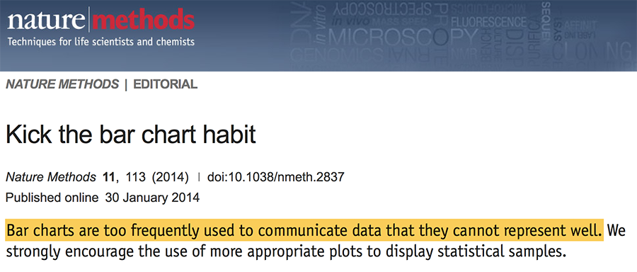
Bar graphs are evil
1) Part of the range covered by the bar might have never been observed in the sample
Bar graphs are evil
2) They conceal the variance and the underlying distribution of the data
Bar graphs are evil
3) They are associated with (usually not defined) error bars
Different types, different meanings:
- Descriptive statistics (SD, range)
- Inferential statistics (SEM, CI)

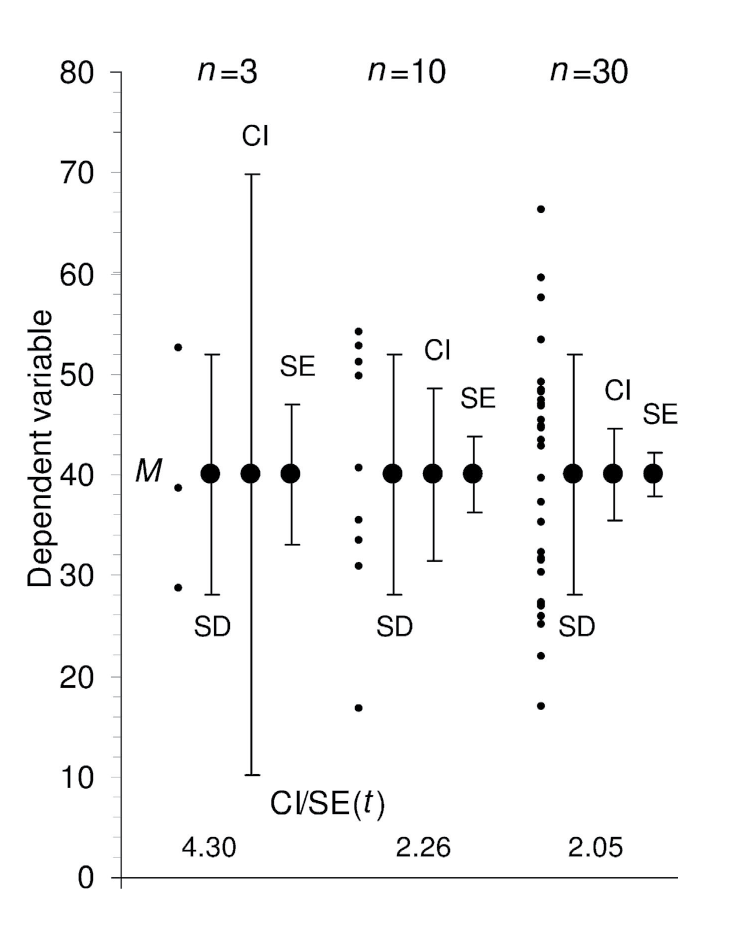
Avoid making bar graphs
To reveal the distribution of the data:
- Display data in their raw form
- A dot plot is a good start
- Dynamite plunger plots conceal data
- Check the pattern of distribution of the values
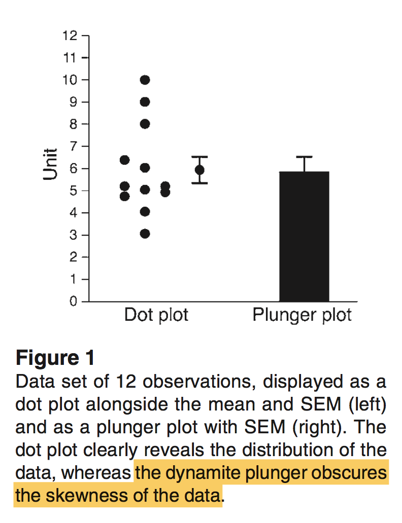
About Figure 1:
- First set: Gaussian (or normal) distribution (symmetrically distributed)
- Second set: right skewed, lognormal (few large values). This type of distribution of values is quite common in biology (ex: plasma concentrations of immune or inflammatory mediators)”
Plunger plots only: who would know that the values were skewed [...] and that the common statistical tests would be inappropriate?”
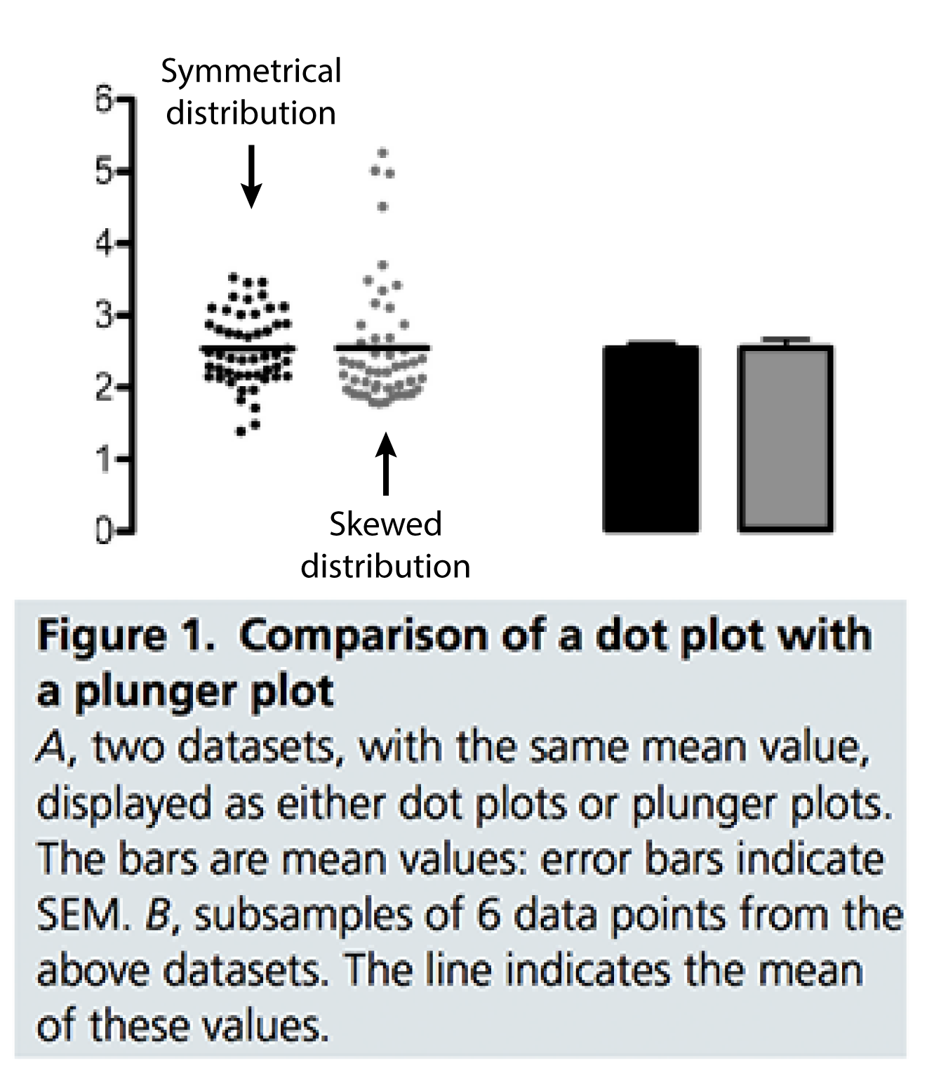
"For better characterization of a sample, we prefer dots plots, or box plots for their ability to display a minimum of five measures of the underlying data."
Avoid making bar graphs
- Impact Factor: 12.575 (2015).
The JCI is one of the top journals in the “Medicine, Research & Experimental” category.
To maintain the highest level of trustworthiness of data, we are encouraging authors to display data in their raw form and not in a fashion that conceals their variance.
Presenting data as columns with error bars (dynamite plunger plots) conceals data. We recommend that individual data be presented as dot plots shown next to the average for the group with appropriate error bars (Figure 1).
Avoid making bar graphs
[...] the amount of information they provide is still limited to two values, the mean and the spread.
"For better characterization of a sample, we prefer dots plots, or box plots for their ability to display a minimum of five measures of the underlying data."
You've been warned before!
Dotplot
If the number of data is relatively small, showing directly the raw data and accompanying mean/median is best.

Boxplot
A boxplot is a graphical display of the five number summary for a quantitative variable. It shows the general shape of the distribution, identifies the middle 50% of the data, and highlights any outliers.

A boxplot includes:
- A box stretching from Q1 to Q3
- A line that divides the box drawn at the median
- A line from each quartile to the most extreme data value that is not an outlier. (if no outliers minimum and maxixum)
- Each outlier plotted individually
Boxplot (example)
A boxplot is a graphical display of the five number summary for a quantitative variable. It shows the general shape of the distribution, identifies the middle 50% of the data, and highlights any outliers.


The gallery of
bad data reporting

Common mistakes in data reporting
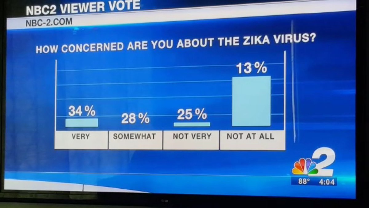
Relative frequencies MUST sum up to 1 (100%)
Common mistakes in data reporting
Relative frequencies MUST sum up to 1 (100%)
Data in pie-chart are hard to interpret

Common mistakes in data reporting
Relative frequencies MUST sum up to 1 (100%)
Data in pie-chart are hard to interpret
3D graphs are misleading

Common mistakes in data reporting
Relative frequencies MUST sum up to 1 (100%)
Data in pie-chart are hard to interpret
3D graphs are misleading
Zero your scale

Common mistakes in data reporting
Relative frequencies MUST sum up to 1 (100%)
Data in pie-chart are hard to interpret
3D graphs are misleading
Zero your scale

Common mistakes in data reporting
Relative frequencies MUST sum up to 1 (100%)
Data in pie-chart are hard to interpret
3D graphs are misleading
Zero your scale
Labels MUST correspond to data
Common mistakes in data reporting
Relative frequencies MUST sum up to 1 (100%)
Data in pie-chart are hard to interpret
3D graphs are misleading
Zero your scale
Labels MUST correspond to data